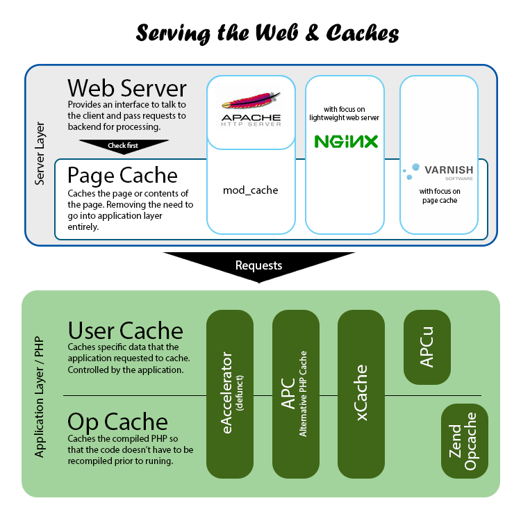
I’m a graph-diagram-table person. And when someone asks how web servers and caches are mixed, I now have an image to give them!  Now we can visually see how web server interacts with a page cache in apache, nginx & varnish. And how user cache and opcache for PHP are separated by services like eAccelerator, APC (and APCu), xCache, & Zend Opcache (aka just Opcache in PHP 5.5+) .
P.S. I have no idea why I wasted an hour trying to make this graph look nice. Actually… I know, but still feels sort of wasteful.

Leave a Reply